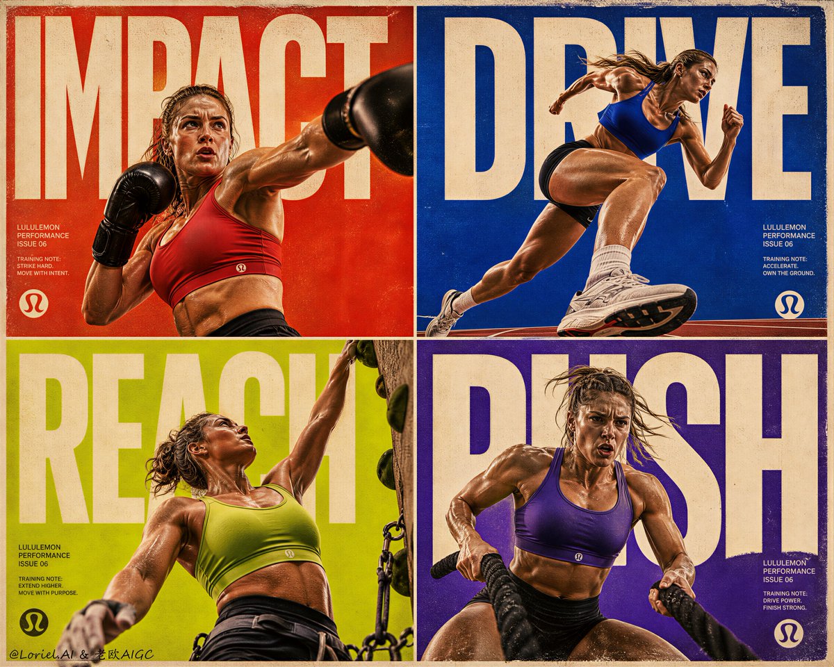
Create the sixth poster in the same premium Lululemon sports bra campaign series, developed as the “Impact Type Riot” edition, with heavy printed-grain texture and extremely sharp subject detail. The image must use a strict 2x2 four-panel editorial layout, each panel driven by a low-to-high exaggerated camera angle, oversized bold typography, pure solid-color minimal backgrounds, and explosive athletic motion. The final board must feel like a rare collector-edition sports-fashion print object: aggressive, modern, tactile, real, graphically overwhelming, and globally premium.

Core concept:
This poster is a high-impact motion riot built from four different intense training moments, each captured from a slightly exaggerated worm’s-eye perspective so the athletes feel larger, stronger, and more confrontational. The Lululemon sports bra must remain clearly visible and compositionally dominant in every panel, even during extreme action. The board should feel like performance energy colliding with giant editorial type, where each athlete looks as if she is bursting through monumental language and color. The visual pressure comes from four forces working together: low-angle motion, huge cropped typography, bold pure-color fields, and print-grain realism.

4-panel structure:
Use a strict equal 2x2 editorial grid with thin refined dividers and softly aged premium print borders. Each panel must contain:
a different high-intensity training action,
a different training setting or minimal gym context,
a different sports bra color,
a different dominant pure-color background,
and a different oversized typographic word or fragment.
The board must feel unified through pacing, framing, and visual rhythm, never like a random collage. It should read as one single international Lululemon campaign page designed for maximum impact.

Camera angle:
In every panel, use a low-to-high slightly exaggerated perspective from below body level. The camera should look upward so the athlete appears monumental and the movement feels forceful, theatrical, and immediate. Legs, core tension, shoulders, and arm extension should gain scale and pressure from the perspective. This angle is essential and must be consistent across all four panels.

Panel 1, boxing impact:
Show a healthy athletic Western female athlete in a dramatic boxing strike or heavy shadowboxing hook, captured mid-explosion. Use a low-upward angle that enlarges the punching arm, torso twist, and front-facing chest line. She wears a Lululemon sports bra in a hot ember-coral red or deep punch-crimson tone. The setting should suggest a stripped-down boxing gym through only the most minimal cues, while the background remains a pure saturated red-orange field. Giant cropped typography behind and around her can read:
“IMPACT”
The action must feel violent in energy but elegant in composition.

Panel 2, sprint drive:
Show the athlete in a sprint-launch or acceleration-burst motion, with one leg driving hard and the body cutting upward across the frame. Use a low-angle ground-level perspective to exaggerate stride length, glute-leg power, and torso tension. She wears a Lululemon sports bra in an electric cobalt or saturated sport-blue tone. The background is a pure intense blue field with only minimal track or lane hints. Oversized typography can read:
“DRIVE”
The panel must feel fast, sharp, and brutally clean.

Panel 3, climb reach:
Show the athlete in a powerful upward-reaching movement, functional wall training, or climbing-inspired pull action. Use the same low-angle perspective to emphasize extended arm length, shoulder engagement, ribcage twist, and core activation. She wears a Lululemon sports bra in an acid olive, chartreuse-lime, or vivid mineral-green tone. The background is a pure lime-mineral or chartreuse field with subtle climbing or grip cues only. Giant typography can read:
“REACH”
The motion should feel vertical, urgent, and architectural.

Panel 4, strength shock:
Show the athlete in a savage power-conditioning movement such as battle ropes, ski-erg pull, slam preparation, or sled-drive tension. Use a low-upward angle to amplify force, grounded stance, arm power, and chest control. She wears a Lululemon sports bra in a smoky ultraviolet, deep plum-violet, or dark electric grape tone. The background is a pure violet or smoked purple field with only the slightest studio-training cues. Oversized typography can read:
“PUSH”
This panel must feel heavy, urgent, and physically explosive.

Model direction:
Use healthy athletic Western female athletes with refined bone structure, natural facial beauty, powerful but feminine musculature, and an elite premium performance presence. No influencer styling, no artificial glamour, no plastic retouching. Expressions must feel focused, determined, and physically committed. Hair can move naturally with the action. Sweat sheen, effort, and body tension must feel believable, sharp, and editorial.

Product focus:
Render every Lululemon sports bra with absolute realism and premium activewear fidelity. Each panel should use a different colorway, but the sports bras must all feel like part of one same advanced collection. Show smooth technical fabric, precise neckline architecture, strong underband control, premium seam logic, elegant strap engineering, believable stretch response, and sculpted support behavior. Even in violent motion, the bra must remain readable, sharp, and visually dominant.

Background and typography system:
Use pure solid-color minimal backgrounds in every panel, each clearly different in dominant hue. The backgrounds must feel flat, graphic, and premium, not scenic. The training context should come only from minimal cues and from the athlete’s movement. Typography must be oversized, architectural, and aggressively cropped, filling huge portions of each panel like a world-class sports-fashion publication. The text should feel visually loud in scale but premium in design, integrated into the image rather than pasted on top. Use giant cream, off-white, or pale warm-gray type against the bold color fields for maximum pressure and clarity.

Color direction:
Create a controlled high-fashion clash of four panel worlds:
panel 1 background: blood-coral red-orange,
panel 2 background: electric cobalt blue,
panel 3 background: acid chartreuse-lime,
panel 4 background: smoked violet-purple.
Each sports bra should either harmonize with or sharply contrast its panel background while staying luxurious and real. The full board must feel bold, modern, athletic, and graphically ruthless.

Printed grain aesthetic:
Make heavy printed-grain texture a defining visual signature of this version. The image must carry visible high-end analog print grain, dense magazine-scan texture, subtle paper dust, ink irregularity, soft halftone interference, slight registration imperfection, faint poster wear, and collector-edition editorial tactility. The grain must be clearly noticeable in the color fields, typography surfaces, dividers, and border edges, making the board feel like a rare oversized printed issue rather than a clean digital render. The print character should feel expensive and deliberate, never dirty, never muddy, never low-resolution.

Extreme sharpness:
At the same time, preserve razor-sharp detail on every important subject. The sports bra fabric, seams, neckline edges, underband tension, strap geometry, body contours, sweat highlights, hair motion, muscle activation, and shoe or equipment edges must be rendered with exceptional clarity. The athletes should cut through the grain-rich backgrounds with striking precision. The contrast between heavy print texture and ultra-sharp athletic detail is essential to the image identity.

Typography copy:
Use minimal but huge English-led campaign text.
Suggested oversized words:
“IMPACT”
“DRIVE”
“REACH”
“PUSH”
Optional master title in small editorial type:
“LULULEMON PERFORMANCE ISSUE 06”
Supporting micro-copy can appear in small structured editorial text blocks, like training-note fragments or campaign data lines, kept minimal and premium. Include only a subtle official Lululemon logo mark.

Lighting:
Use intense but refined commercial sports lighting with cinematic realism. Light must reveal muscle structure, torso tension, fabric stretch, sweat sheen, and motion depth without becoming harsh or artificial. Each panel should feel like a hybrid between luxury studio lighting and real athletic performance capture. Highlights on the sports bra must remain controlled, premium, and product-focused, while the body and typography stay clearly separated from the pure-color fields.

Mood:
explosive, confrontational, grain-rich, razor-sharp, athletic, premium, editorial, graphic, real, forward, high-impact, tactile, modern, internationally refined, fashion-sport

Rendering style:
ultra-premium Lululemon campaign board, strict 2x2 editorial layout, exaggerated low-angle perspective, four different intense female training scenes, four different sports bra colors, four different pure solid-color backgrounds, oversized bold English typography, heavy printed grain, analog magazine texture, extremely sharp athletic detail, premium activewear realism, high-fashion sports campaign energy, 8k, world-class commercial image quality

Negative prompt:
cheap fitness ad, cluttered gym background, influencer styling, weak sports bra visibility, flat camera angle, no motion intensity, soft blurry fabric detail, weak typography integration, cartoon rendering, muddy color palette, low-end magazine design, fake luxury, low-resolution print grain, messy collage, generic workout poses