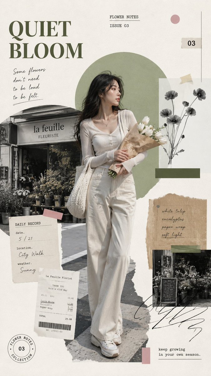
Create a 9:16 vertical editorial collage poster.

Theme: [THEME]
Series title: [TITLE]
Subtitle: [SUBTITLE]
Main subject: [PERSON / PRODUCT / SCENE]
Setting: [CITY STREET / COAST / FLOWER SHOP / CAFÉ / OTHER]
Main colors: [COLOR 1] + [COLOR 2]
Accent color: [ACCENT COLOR]
Small text elements: [TIME / LOCATION / ISSUE NUMBER / SHORT PHRASES]

Use a warm off-white paper background with generous negative space. Place one realistic full-body subject as the main visual anchor, occupying around 60–70% of the poster height. The subject should feel natural and alive, with realistic skin, hair, clothing texture, body proportions, and a relaxed everyday action rather than a stiff fashion pose.

Build the composition with layered torn-paper photography, grayscale environment fragments, receipts, tickets, handwritten notes, small labels, stamps, paper tape, and 1–2 bold geometric color blocks. Keep all supporting elements secondary to the main subject.

Use a balanced mix of large editorial typography, small typewriter-style labels, and a few handwritten lines. The text should feel original and connected to the theme, not copied from any reference image.

The overall look should feel like an independent magazine page, visual diary, travel journal, or lifestyle moodboard: nostalgic, clean, tactile, slightly imperfect, and carefully composed.

Keep the visual hierarchy clear:
1. Main title
2. Full-body subject
3. Large color shape
4. Grayscale scene fragments
5. Small notes and labels

Avoid overcrowding, excessive text, repeated layouts, copied phrases, plastic-looking skin, distorted hands, unrealistic clothing, messy collage placement, cheap sticker aesthetics, and unreadable typography.