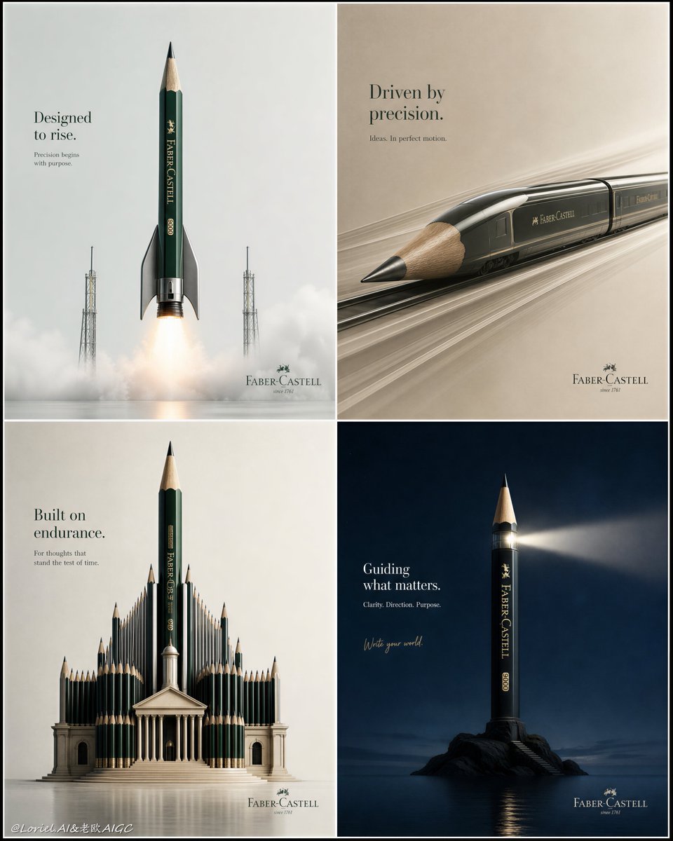
Create an ultra-premium vertical 4-panel campaign board for Faber-Castell pencils, designed as a refined 2x2 grid of four collectible minimalist advertising posters unified into one luxury presentation sheet. Preserve the same core concept of four different pencil-based miracle images, but push the campaign into a more expensive, more restrained, more gallery-grade direction: stronger color contrast between the four panels, more breathing room, more negative space, less text, and a more sophisticated international design-book feeling.

Each of the four panels must feature a real Faber-Castell pencil as the absolute hero product, transformed into a different highly creative object-fusion concept with seamless realism and zero visual awkwardness. Every panel must feel like a premium stand-alone print ad, but together they should read like an elite brand proposal board. The product itself must always remain hyper-realistic and recognizable: authentic Faber-Castell proportions, real lacquered body, sharpened wood grain, graphite tip texture, premium printed branding detail, and impeccable material fidelity.

Push the visual luxury much further by making the four panels cleaner and more spacious. Give each panel more empty background, more formal restraint, and more elegant placement of the hero object. Avoid filling the frame too much. Let the miracle object sit in a more powerful field of negative space, so each concept feels more iconic and expensive. Typography must be more reduced than before: only a concise English headline, a tiny supporting line, a subtle official Faber-Castell brand mark, and if desired one restrained handwritten-style accent phrase. The text must feel lighter, quieter, and more confident, never loud or busy.

Make the four color systems clearly distinct and more luxurious in contrast with each other:

Panel 1: a futuristic pencil-rocket concept in a pale cool grey or off-white space, with the pencil transformed into a sleek launch vehicle. Use a cold premium palette of emerald green, metallic silver, graphite black, and faint launch-fire amber. The object should feel engineered, aerodynamic, and visually sharp, surrounded by clean negative space and a subtle sense of lift-off.

Panel 2: a pencil-high-speed-train concept, with the sharpened graphite tip forming the aerodynamic nose and the body extending into a streamlined rail machine. Use a completely different palette, such as warm stone beige, charcoal, muted olive, and brushed steel. The scene should feel fast yet calm, elegant yet precise, with even more minimal background and refined motion cues.

Panel 3: a pencil-architecture concept, where pencils form a grand cultural monument or library with one dominant upright pencil as the central spire. Use a richer but disciplined palette such as soft limestone, ivory, deep forest green, and antique bronze. The composition should be frontal, poised, and monumental, with strong vertical dignity and generous negative space around the structure.

Panel 4: a pencil-object metaphor concept with even greater minimalist intelligence, such as the pencil transformed into a lighthouse, a bridge, a conductor’s baton, or an ascent tool. The concept must feel poetic, master-level, and visually pure. Use a bold contrasting palette that is entirely different from the other three, such as deep midnight blue, warm ivory, and a single saturated accent, or rich burgundy with pale blush and matte black. Keep it the most restrained and artful of all four panels.

The four panels must not feel repetitive. Each should use a different compositional rhythm, scale, perspective logic, and emotional tone, but all should share the same premium realism and minimalist intelligence. The color contrast between the four posters should be clear at first glance, yet each palette must remain elegant and controlled rather than noisy. The whole sheet should feel like a brand campaign selected for an international design annual.

Typography across all four posters should be official, premium, and highly restrained. Use concise English titles only, with minimal supporting copy and very subtle logo identification. The handwritten phrase, if included, should be tiny, elegant, and secondary. Text should never compete with the product. It should function more like editorial whisper than advertising shout. Allow the negative space and the product idea to carry the luxury.

Lighting must be exceptionally soft, precise, and commercial-premium across all four panels. Use clean directional highlights, crisp edge definition, refined shadow control, subtle reflective behavior, and tactile material realism. Add only minimal atmospheric cues where appropriate, such as refined motion blur, soft air particles, or delicate launch glow, but keep everything controlled. Finish the entire 4-panel board with subtle heavy print grain and razor-sharp detail, like a luxury print portfolio object.

Avoid childish illustration style, avoid cluttered props, avoid repeated colors, avoid repeated compositions, avoid noisy text, avoid generic school-product advertising, avoid flat lighting, avoid cheap surrealism, avoid awkward product distortion, avoid overfilled layouts, avoid excessive graphic decoration.