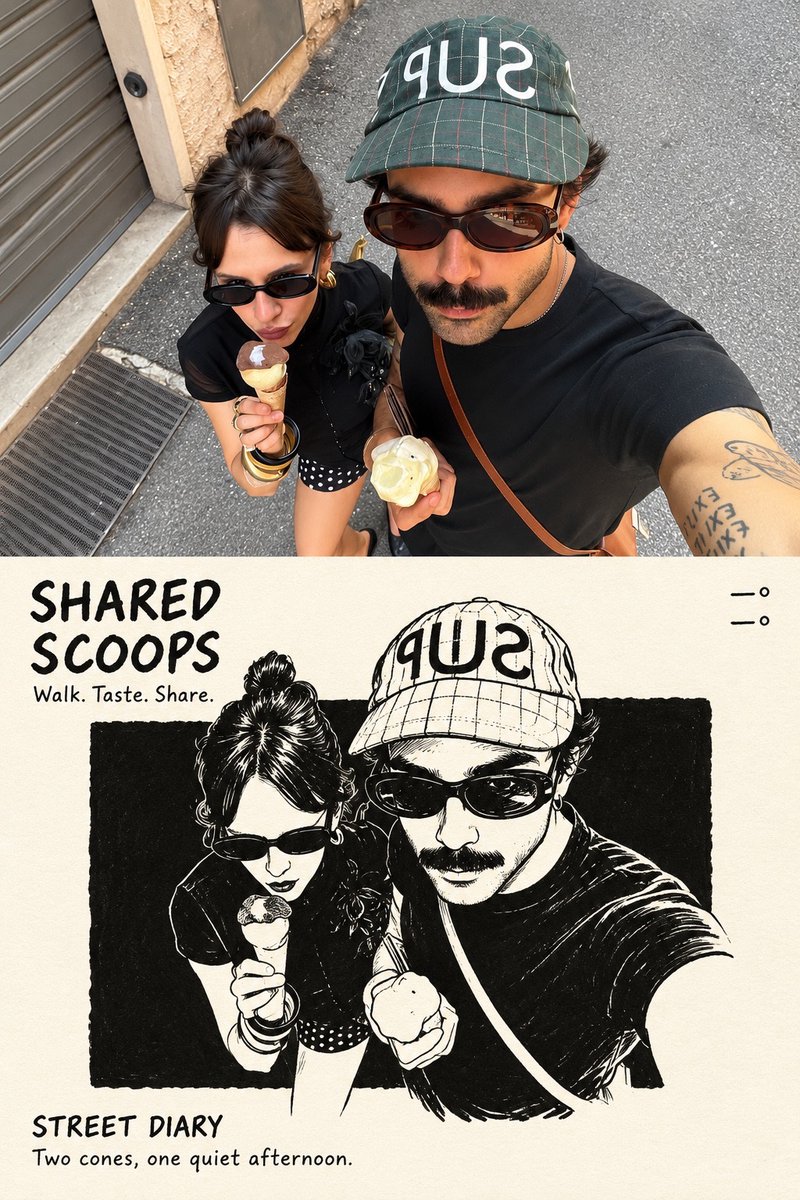
Using the uploaded reference image, create a single high-resolution vertical 2:3 editorial art poster.

Divide the canvas into two perfectly equal horizontal sections, each occupying exactly 50% of the total height. Separate them with a clean, perfectly straight horizontal dividing line.

1. TOP HALF — ORIGINAL REFERENCE PHOTOGRAPH

Use the uploaded reference photograph directly in the upper 50% of the poster.

Preserve its original photographic quality, sharpness, natural lighting, and color relationships.

Allow only subtle, intelligent cropping around the outer edges when necessary, without compromising the main subject.

If required, naturally extend a small portion of the surrounding environment to fit the composition.

Do not redraw, illustrate, stretch, blur, or modify the subject's appearance, structure, or spatial relationships.

Do not introduce black borders, white margins, or empty edges.

2. BOTTOM HALF — MINIMALIST EDITORIAL ILLUSTRATION

Use a warm, near-white ivory paper background with an extremely subtle paper texture.

Analyze the main subject and visual story of the uploaded reference image.

Extract only the primary subject, preserving one or two essential identifying elements.

Remove or heavily simplify all secondary details, including background architecture, crowds, vehicles, fences, signs, trees, and other unnecessary elements.

Transform the primary subject into a sophisticated black-ink editorial illustration.

ILLUSTRATION STYLE:

Use natural, clean pen strokes with varied line weight.

Preserve an authentic hand-drawn appearance with expressive but controlled linework.

Avoid overly precise engraving aesthetics, excessive internal details, and dense cross-hatching.

Place a large, nearly pure-black rectangular ink block behind the illustrated subject.

The rectangular block should have subtly imperfect, handmade print-style edges.

Keep the black background clean, with only fine paper grain and minimal noise.

Avoid obvious hatching, scratches, architectural lines, or complex textures.

ILLUSTRATION SCALE AND COMPOSITION:

The illustrated subject must occupy approximately 72–77% of the canvas width and 58–64% of the bottom section's height.

Maintain a clear visual focal point with generous negative space surrounding the illustration.

3. COLOR RULES

The bottom illustration must follow a strictly black-and-white color palette by default.

Preserve only one localized accent color if the original reference image contains a clearly distinctive, concentrated color element with meaningful narrative importance.

Ordinary blue skies, green vegetation, stone surfaces, skin tones, and environmental colors must not be treated as accent colors.

Any preserved accent color must remain strictly localized to the relevant subject or area.

Never allow accent colors to spread across the entire illustration.

4. TYPOGRAPHY AND EDITORIAL LAYOUT

Automatically generate concise, meaningful English typography based on the content of the uploaded reference photograph.

The typography must resemble handwritten editorial annotations from an independent art publication.

TOP-LEFT CORNER:

Generate a short handwritten title consisting of 2–5 words, arranged across two lines.

Directly beneath the title, include three short English action verbs relevant to the photograph.

TOP-RIGHT CORNER:

Display only two lines of geographic coordinates:

Latitude
Longitude

Do not include any additional text in this area.

BOTTOM-LEFT CORNER:

Display the location name followed by the word "DIARY."

Directly beneath it, add one short descriptive English sentence inspired by the photograph.

TYPOGRAPHY STYLE:

Use a rough, upright, slightly irregular handwritten typeface.

Maintain subtle imperfections and a natural editorial annotation aesthetic.

Avoid elegant cursive, calligraphy, overly decorative lettering, and excessively polished typography.

5. FINAL ART DIRECTION

The finished poster must combine:

Authentic, high-quality photography.
Minimalist black-and-white editorial illustration.
Generous negative space.
Independent art publication aesthetics.
Quiet, restrained, sophisticated visual storytelling.
Natural handwritten typography.
A balanced relationship between documentary realism and expressive hand-drawn artwork.

The overall result should resemble a carefully designed, collectible editorial art print.

6. FINAL OUTPUT REQUIREMENTS

ASPECT RATIO:
2:3 vertical.

RESOLUTION:
High-resolution, sharp, print-quality output.

COMPOSITION:

Exactly 50% original reference photography on top.

Exactly 50% editorial illustration on the bottom.

One perfectly straight horizontal dividing line.

One complete, standalone poster.

RESTRICTIONS:

No collages.
No multi-poster layouts.
No combined images.
No unnecessary decorative elements.
No modifications to the original subject's identity or appearance.
No excessive illustration details.
No changes to the original photograph's natural color relationships.

FINAL GOAL:

Create a sophisticated, visually balanced editorial art poster that faithfully preserves the uploaded reference photograph while transforming its primary subject into an expressive, minimalist black-ink illustration.