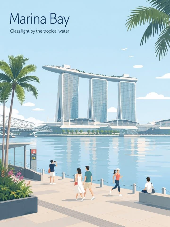
Create a fresh, airy, elegant city travel poster that feels uniquely designed for [CITY_NAME], not reused from another city.

IMPORTANT COMPOSITION RULE:
Before drawing, identify the unique “city DNA” of [CITY_NAME]:
1. one primary landmark or skyline feature,
2. one local movement or transport cue,
3. one everyday lifestyle moment,
4. one native plant / local environmental detail,
5. one spatial composition that fits this city specifically.

Do NOT reuse the same layout formula across cities.
Avoid defaulting to:
- a shop always on the right,
- a signboard always on the left,
- people always sitting at a café table,
- the same foreground flower bed,
- the same lamppost position,
- the same waterfront promenade composition.

Each city must have a different scene structure, chosen from its real atmosphere:
harbour lookout, laneway street, riverside park, beach walk, hilltop viewpoint, market corner, tram street, ferry quay, botanical garden, old town street, coastal boardwalk, cultural square, or skyline overlook.

Typography:
Place “[CITY_NAME]” in the upper-left with generous typography-safe negative space.
Add one short refined English caption that matches the city mood.
Keep the typography elegant, minimal, and premium.

Scene adaptation:
Automatically adapt the scene to [CITY_NAME].
Use one iconic primary landmark as the main visual anchor.
Add only 2–4 supporting local details that truly belong to the city.
Do not create a landmark collage.
Do not overfill the background.

People:
Use only 3–6 small figures.
Each person should perform a city-specific everyday action:
walking, sketching, cycling, waiting for a tram, boarding a ferry, carrying a surfboard, taking a quiet photo, reading in a park, jogging by the water, browsing a small market.
Avoid crowd scenes.
Avoid one dominant hero character.
People should feel naturally placed within the city, not copied from previous posters.

Local details:
Use local transport, signage, street furniture, plants, food, architecture, and leisure details only when they fit the city.
Transport signs must not always appear as a large vertical signboard.
They may appear subtly as a tram stop marker, ferry route board, station clock, bike lane symbol, beach patrol flag, small metro icon, or painted pavement mark.

Style:
Japanese stationery aesthetic,
luxury sticker illustration,
premium commercial flat-vector travel poster,
clean thin outlines,
consistent line weight,
flat colors only,
soft minimal shapes,
calm editorial composition.

Palette:
Use pale powder blue, soft sky blue, and mist blue as the atmospheric base.
Use warm cream, soft beige, sage green, and muted gray-green for architecture and nature.
Use dusty rose or blush pink only as tiny accents on flowers, signs, awnings, clothing, or small decorative details.
Keep the palette refined, toned-down, and high-end.

Mood:
fresh, minimal, elegant, calm, refined,
high-end travel postcard,
quiet lifestyle branding,
open space, breathing room, relaxed local rhythm.

Negative prompt:
No realism.
No watercolor.
No painterly effects.
No photorealism.
No heavy shading.
No gradients.
No paper texture.
No dense background.
No repeated café-on-right layout.
No repeated signboard-on-left layout.
No generic tourist poster collage.
No crowded street.
No oversized people.
No dramatic lighting.