# POSTAGE MEMORY RELIEF | Postage Memory Print

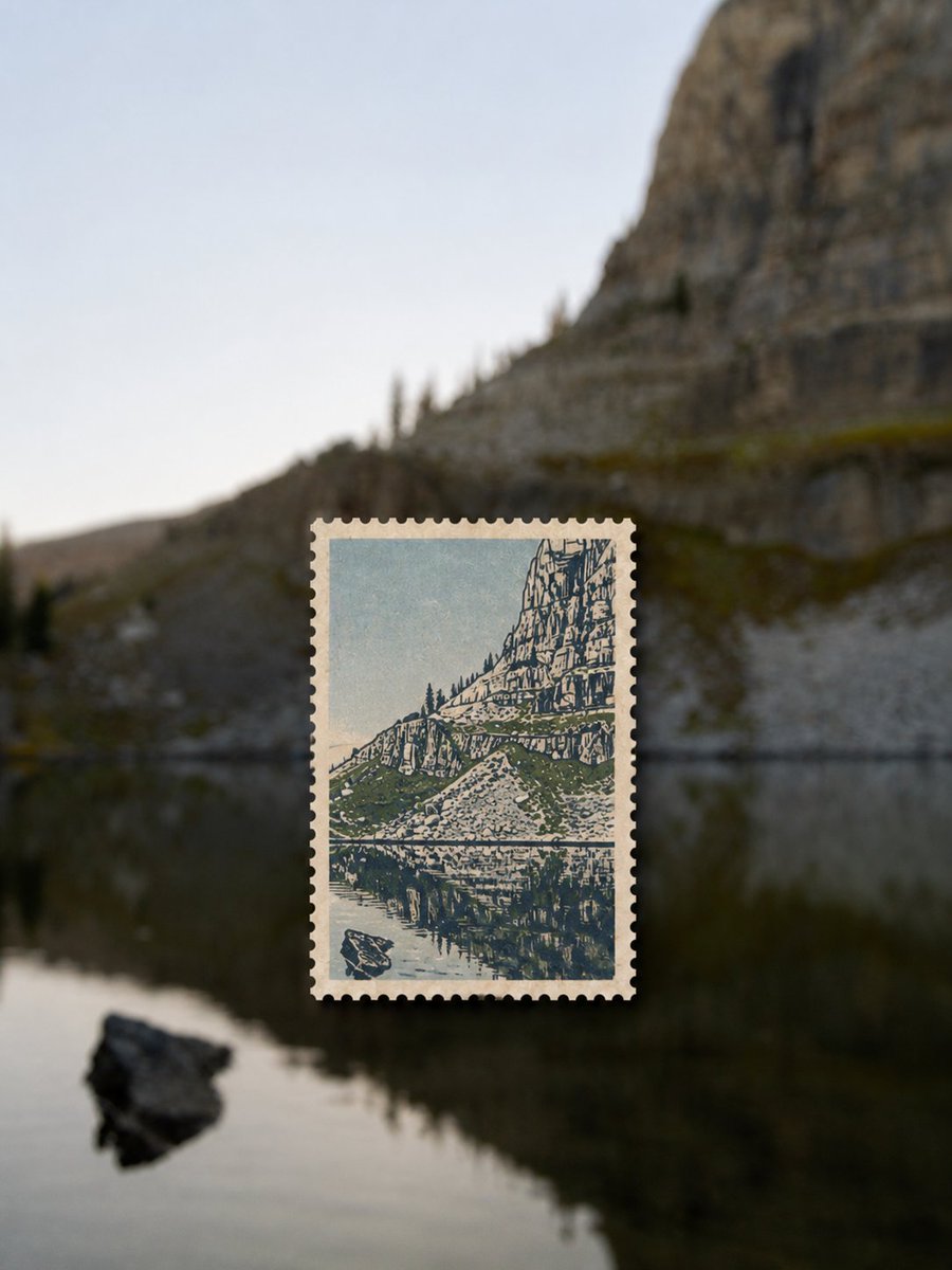
Please create each input photo into a separate, high-quality travel art image. Each photo should be output individually, without multi-image collage. The overall composition uses a 3:4 vertical aspect ratio: the original location serves as a full-frame, strongly defocused real photographic background; the same location is re-engraved into a physical stamp floating in the center of the image. The image conveys the idea that 'the environment is fading away, while memories are preserved within the stamp'.

## Background: Defocused Real Location

Use the same scene, subject, terrain, architecture, colors, and lighting from the input photo as the full-frame background. Maintain its realistic photographic properties and original color atmosphere, but apply obvious and natural lens defocus, shallow depth of field, and soft bokeh, so that large outlines, horizons, and iconic color blocks can still be perceived, while details recede completely.

The background must not be replaced with irrelevant gradients, studio settings, or solid colors. Do not distort the subject, and do not add extra people, buildings, or vehicles. The defocus effect must resemble a real camera focusing on a nearby stamp, not a cheap Gaussian blur filter; preserve natural spatial depth, atmospheric perspective, and light transitions.

## Central Stamp: Clear Memory Carrier

Place a vertical physical stamp in the center or slightly below the center of the image, with a width of approximately 30%–38% of the entire image and a height of approximately 28%–38%. The stamp must be perfectly clear, creating a distinct depth-of-field contrast with the blurred background.

The stamp should use warm off-white, slightly thick, uncoated fiber paper. It should have uniform, realistic, small semi-circular perforations around its edges; the perforations are not decorative lace or jagged patterns. The stamp edges should show slight wear, indentations, and paper thickness, casting a restrained, soft, consistently directed real shadow on the background, making it appear to float a few millimeters or be affixed to a glass surface.

Leave a narrow, uniform off-white paper border inside the stamp. Do not directly shrink or copy the original photo. Extract the most recognizable subject, outline, spatial direction, and location features from the original photo, and re-engrave them into a 2–4 color modern letterpress print, woodcut, linocut, or silkscreen print.

## Printmaking Language

The inside of the stamp should use a few iconic colors extracted from the original photo: a light color for the sky or paper base, a dark color for structure and shadows, a warm color for the main subject or visual focus, and a fourth restrained accent color if necessary.

Use a rough, direct printing language with manual imperfections:

- carved relief-print shapes
- rough linocut edges
- distressed ink coverage
- visible paper grain
- uneven pigment transfer
- broken contours
- simplified silhouettes
- small registration misalignment
- occasional scratches and worn patches

Retain the most important identifying features and direction of movement of the subject, but actively remove minute structures, realistic light and shadow, and complex textures. Reorganize the scene using large positive and negative shapes, thick lines, and color blocks, rather than creating finely detailed realistic illustrations. The print should have a mature modern graphic design feel, not a child's rubber stamp.

## Composition and Color Correspondence

The background and the stamp must depict the same location, the same subject, and a similar viewing direction, so that the viewer can understand the stamp as a memory translation of the background scene. However, the inside of the stamp allows for strong generalization, cropping, and reorganization; it does not need to replicate the original photo's composition item by item.

The stamp's color palette must come from the background photo; at least one most recognizable main subject color must be retained. The background is soft due to defocus, while the stamp, with its limited-color printmaking and sharp edges, becomes the sole visual focus.

## Text

By default, do not add country names, denominations, postmarks, logos, titles, or superfluous text, to avoid garbled text generation by the model. Only when explicitly requested by the user, add a very small, accurate location name or year; the text must appear as part of the stamp's printing, not a label affixed later.

## Overall Vibe

A combination of travel memories, independent publications, experimental photography, modern letterpress printing, old stamp collecting, and contemporary editorial design. Quiet, warm, nostalgic, restrained, with a sense of distance, like a small, clear piece of evidence preserved from a journey.

## Strictly Avoid

Avoid ordinary photo stickers, directly shrinking the original photo, realistic photography inside the stamp, white rectangular photo frames, oversized stamps, multiple stamp collages, envelope scenes, hands holding stamps, desktop flat lays, fake postmarks, fake denominations, garbled text, logos, watermarks, cartoons, anime, 3D plastic feel, smooth vector graphics, neon colors, overly vibrant colors, cheap filters, completely unrecognizable backgrounds, irregular jagged or lace edges.