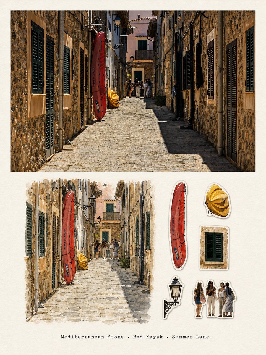
Using the currently uploaded photo as the sole reference, create a complete, independent, high-end travel editorial poster in a single image editing generation.

Do not add other reference photos, do not create multi-photo collages, nine-grid layouts, or poster display mockups. Only output the front of the poster itself.

I. Overall Layout

Use a precise 3:4 vertical composition.

The image is divided into two areas of approximately 1:1 height, each occupying about 50% of the total. Use a clear, horizontal, restrained dividing line in the middle.

The upper part is a high-fidelity real photography area, and the lower part is a "TRAVEL STICKER JOURNAL" travel watercolor sticker observation page of the same scene.

Both the upper and lower areas must depict the same location, the same subject, and the same travel memory.

II. Upper Part: High-Fidelity Preservation of the Original Photo

The upper part must faithfully preserve the uploaded original photo.

Accurately maintain:

- Identity and quantity of subjects
- Posture, action, direction, and interrelationships of people or animals
- Architectural structure, street direction, and topography
- Vehicles and core objects
- Original observation angle and spatial perspective
- Real textures
- Natural light and shadow
- Original color atmosphere
- Relative positions of all important objects

The upper part must clearly still look like a real photographic work, not a watercolor, illustration, or AI-recolored photo.

Only very slight, restrained high-end photographic color grading, dynamic range adjustment, and extremely thin film grain are allowed, to give it the texture of an independent travel magazine, architectural photography, and art publication.

To adapt to the upper area, the sky, ground, or surrounding environment can be naturally extended, but the extended area must conform to the perspective, texture, light, and spatial direction of the original photo.

Do not stretch, squeeze, distort, mirror, duplicate subjects, change people, reshape buildings, replace the sky, or fill edges with blurred photo copies.

If natural extension is not reasonable, it is better to use clean off-white paper margins consistent with the poster than to damage the original photo.

III. Lower Part: TRAVEL STICKER JOURNAL

Design the lower part as a mature, restrained, observant travel collection journal page.

The background uses warm ivory natural illustration paper, with clear but not exaggerated paper texture, subtle fibers, and a slight old travel album print feel.

The lower part consists of two sections:

1. A travel watercolor main illustration on the left or mid-left
2. A travel memory sticker index on the right

The main illustration and all stickers must be extracted from the upper original photo. Do not add landmarks, objects, people, or generic travel symbols that are not present in the photo.

IV. Travel Watercolor Main Illustration

The main illustration occupies approximately 65%–72% of the lower part's width, placed in the left or mid-left area.

Redraw the same scene according to the observation angle of the original photo, preserving:

- The most recognizable subjects
- Main outlines and postures
- Direction of streets, buildings, or landscapes
- Action relationships of important people
- Vehicles or key objects
- 3–7 core elements that reflect the characteristics of the location

Use the following hand-drawn language:

fine ink linework,
transparent watercolor,
gouache accents,
colored pencil texture,
dry brush,
slightly broken lines,
minor pigment overshoot,
visible paper grain,
naturally unfinished watercolor edges.

Use relaxed, accurate but not mechanical pen line art, transparent watercolor, a small amount of opaque gouache, and colored pencil texture.

Slight over-lining, color block misalignment, dry brush breaks, and paper show-through are allowed.

Actively remove duplicate people, duplicate windows, complex advertisements, dense signs, clutter, and unimportant background details.

Do not pixel-by-pixel replicate the photo, nor simply apply a watercolor filter to the photo.

The main illustration should be simpler and lighter than the photo, but still have a clear sense of place, atmosphere of life, and observational perspective.

The edges of the illustration should not form a complete rectangular border. Let some watercolors, lines, and color blocks naturally break off, fade, and disappear into the ivory paper.

V. Travel Memory Sticker Index

Reserve approximately 22%–28% of the vertical paper space on the lower right for 5 independent travel memory stickers.

Each sticker must extract a specific, recognizable object or local feature from the current original photo.

Prioritize:

- Iconic vehicles
- Architectural details or unique windows
- Awnings
- Shapes of shop signs
- Streetlights
- Plants
- Coffee cups or food
- Boats
- Seats
- Local daily necessities
- Representative human silhouettes
- Particularly striking colors or objects in the original photo

Select the 5 most recognizable elements based on the current photo.

All stickers must have a clear source in the upper original photo.

Prohibit adding airplanes, passports, suitcases, map pins, compasses, stamps, cameras, globes, or famous landmarks that are not present in the photo.

Sticker usage:

- Warm white narrow die-cut edge
- Very fine dark gray hand-drawn outline
- Very slight paper shadow
- Varied sizes but orderly arrangement
- Pen, watercolor, gouache, and colored pencil texture consistent with the main illustration

Maintain distance between stickers; do not connect them.

Do not create mobile emojis, children's reward stickers, cute cartoon stickers, or tourist souvenir templates.

VI. Color

Extract 5–8 main colors from the upper original photo and use them uniformly for the lower main illustration and stickers.

Retain one to two most location-identifiable iconic colors, and appropriately desaturate the remaining colors.

Overall color scheme should be bright, natural, and warm, but not candy-like or neon.

Paper remains warm ivory.

The upper and lower areas form a natural echo through subject colors, outlines, postures, and visual symbols.

VII. Text

Add only a short English travel observation sentence at the bottom of the lower part:

"[Insert footer text here]"

The text must be verbatim accurate; do not modify, add, delete, or misspell.

Use a small, restrained typewriter font, monospaced serif font, or gentle book serif font, horizontally centered.

The text should be like a footer description in a travel album, not an advertising headline.

Except for this line of text, do not add any year, number, brand, logo, QR code, website, slogan, long paragraph, or meaningless text.

If no footer text is provided, maintain a text-free design and do not invent text.

VIII. Overall Aesthetic

travel sticker journal,
urban watercolor field illustration,
mature travel sketchbook,
visual souvenir index,
die-cut memory stickers,
fine ink linework,
transparent watercolor,
gouache accents,
colored pencil texture,
warm ivory paper,
everyday travel observation,
independent travel magazine,
architectural travel journal,
refined editorial order,
specific sense of place.

The overall aesthetic should be like an independent travel magazine, an architect's urban observation book, and a mature illustrator's travel collection page.

The aesthetic is friendly, bright, specific, light, lifelike, and observant, while maintaining the white space and order of high-end editorial design.

IX. Mandatory Avoidance

Avoid:

multiple-photo collage,
grid layout,
poster mockup,
frame,
wall scene,
hand holding poster,
upper-half illustration,
redrawn photograph,
changed identity,
changed face,
changed pose,
altered architecture,
duplicated people,
mirrored extension,
stretched photograph,
blurred-photo side fill,
unrelated lower scene,
generic travel icons,
airplane icons,
passport graphics,
map pins,
invented landmarks,
kawaii sticker sheet,
children's reward stickers,
emoji style,
anime,
cartoon characters,
glossy vector stickers,
thick sticker borders,
heavy drop shadows,
neon palette,
dense scrapbook decoration,
excessive torn-paper collage,
photorealistic lower panel,
full-photo watercolor filter,
unreadable fake signage,
gibberish text,
excessive typography,
fake brands,
cheap souvenir template,
watermark,
decorative border.

The most important rules:

The upper part must be a high-fidelity photographic preservation of the current original photo.

The lower part must be a travel observation page consisting of a "travel watercolor main illustration of the same scene + 5 object stickers entirely from the original photo's index."

All content must be completed in a single generation; do not generate materials separately, do not show the production process, and do not output multiple images.
When using, simply replace:

[Insert footer text here]

with a short sentence similar to the following:

Blue Harbor · Tram Glow · Night Slope.

If no text is needed, delete the entire "Text" paragraph and explicitly state:

The lower part maintains a text-free design, and no text should be generated automatically.